

Design trends 2026: the recipe behind the dish
Four trends, four principles, and one thing worth remembering: copying the look isn't the same as understanding why it works.

Every year brings a fresh crop of email design trends. The harder question is which ones are actually worth using, and which just don't fit your brand.
That's what this year's Design Trends session set out to answer. Logan Sandrock Baird sat down with Alex Wilson (Developer Relations and Documentation Lead for Beefree SDK) and Abby McCune (Director of Campaign Management at Ingredient) to look past the surface of 2026's biggest visual trends in email and unpack the design principles that actually make them work, so you can borrow the idea without copying the look. And since Abby runs campaigns for food clients, the whole conversation leaned into a cooking metaphor that stuck for the full hour. If you missed the live session, the full recording is above.
As Logan put it at the start, trends are a lot like viral TikTok recipes. You can jump in and try one out, and what you end up with might look roughly like what you saw on screen. But if you don't understand the fundamentals of cooking, you won't know why it works, and you won't be able to adjust it for your own palate. So instead of just cataloging what's trending, the session broke each trend down into the underlying design principle. The four trends on the table were illustrations, bold typography, earth tones, and rounded corners.
What makes an email actually work
Before getting into the trends, the panel set the table (their words, not ours) on what effective email design even means. Email design is a subset of information design, and information design exists to create comprehension.
According to the panel, three things must be true for an email to do its job:
- It needs to be comprehensible
- It needs to be accessible, which really just means comprehensible across a wide range of circumstances
- It needs to lead to a clear action, because design is fundamentally about solving a problem
For a closer look at what accessible design looks like in practice, our accessible email makeovers breakdown walks through real before-and-afters.
With that base recipe in place, the panel moved into the four trends pulled straight from the Really Good Emails inspiration gallery data.
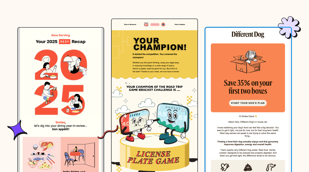
Trend 1: Illustrations and the principle of visual hierarchy
The examples included Resy, Phillips 66, and Different Dog, Touchland rounded out the set, leaning into an anime-inspired illustration style.
Illustrations draw the eye, and that's the whole point of them. But the underlying principle is visual hierarchy: arranging elements so your audience immediately understands what matters most, what to look at first, second, and last. The largest elements, usually your H1, should signal the email's primary focus. Contrasting, accessible colors create the visual friction that pulls attention toward CTAs. Headlines, subheadings, and body copy should stay consistently sized rather than growing more dramatic with each use, and semantic HTML tells any machine reading the email what order things matter in, too, which increasingly includes AI summaries. Alex added a layer worth keeping in mind here. Visual hierarchy is really just how our brains already work: we're wired to look for patterns and sort unfamiliar things into something more recognizable, so a lot of these rules simply mirror that instinct back at us. There's a practical upside, too.
Once your H1s always look like your H1s and your H2s always look like your H2s, you're not rebuilding that decision from scratch every time you sit down to design an email. It reduces the cognitive load for both the person building the email and the person reading it. Abby raised a point worth keeping top of mind on that: an illustration is only doing its job if it adds value rather than distracting from the message. If the image doesn't load, whether from spotty wifi, blocked images, or a screen reader, the message still needs to land. That means the alt text needs to describe what the image actually shows, since it's the only thing a screen reader has to work with. RGE Studio's AI Assistant can generate that alt text automatically as you build, so it's less of a step you have to remember to go back and do.
What actually creates hierarchy, illustration or not, is a clear focal point.
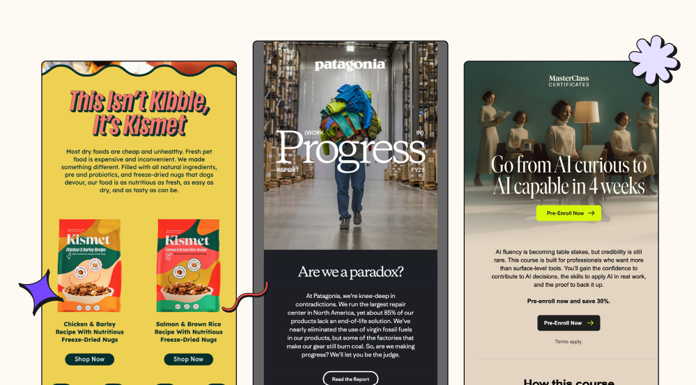
Trend 2: Bold typography, and the principles of scannability and choice reduction
Big, oversized type showed up everywhere this year, including a punny headline at Kismet ("This Isn't Kibble, It's Kismet") and a single bold word taking over the screen at Patagonia ("Progress"), and a course pitch turned scannable at MasterClass ("Go from AI curious to AI capable in 4 weeks"). Two principles sit behind bold type.
The first is scannability. Most people are not sitting quietly with a glass of something nice, giving their email their full attention. They're skimming on a phone between meetings. A few working minimums emerged from the session.
- Body copy at 16px minimum, 18px is even better
- Line height around 1.5, up from the tighter 1.2, that's easy to default to
- Left-aligned text for anything over two or three lines
- Headlines are noticeably larger and consistently sized across sends
The panel agreed that they generally want to avoid centered text for multiple lines. Centering creates a different entry point on each line, making it harder to parse, especially for readers with dyslexia. Alex summed up the reasoning simply: has anyone ever seen a centered book?
Logan showed exactly what this looks like in practice, pulling up one of RGE's own Glow Up emails from June, headlined "Can your subscribers read your emails?" For the sake of example, they’d made the body copy dense and compressed, tight enough that it read as one solid block rather than something you could skim. Live in the editor, they bumped the font up to 16px, broke the copy into shorter lines with selective bolding, and added 20px of padding around the reminder callout and the button below it. Once that was in place, you could tell at a glance what the email was even about, without having to read a single word closely.
Two quick tests were noted to check your own work this way. The blur test, where you step back from the email or squint until you can't read individual words, and see how much still makes sense. The glance test, where you look away after a few seconds and count how many things you actually retained. If you want to get precise about line height specifically, there's also a golden ratio typography calculator (grtcalculator.com) that takes your font size, content width, and typeface and spits out a mathematically ideal line height.
The second principle is choice reduction, which is about preventing decision fatigue. Logan framed it around a scenario most of us know too well: getting to the end of a long day and having someone ask what you want for dinner, only to have no answer left in you. Rather than asking an open-ended "where should we eat," a good friend curates two or three options that already work for everyone, or better yet, just picks a place for the group, the food-captain instinct. In an email, that means giving your audience one clear focus and stripping things down to just what's needed to support that action.
Alex pushed the metaphor further, and it's worth carrying with you. If someone isn't in the mood to make decisions, they're not going to a place like the Cheesecake Factory, where you're handed a binder and left to figure it out yourself. They'd rather go to a Michelin-starred restaurant, where the chef has already done the thinking and simply presents a short, curated set of options built around what you're likely to enjoy. This doesn't mean one CTA per email is a universal law. Newsletters can carry several. Abby's food clients often run recipe emails featuring two or three recipes at once, because that fits the audience and the content. The real rule is not diffusing attention past the point where the reader can still tell what you're asking of them, and repeating a single CTA is often smarter than adding a second, different one.
The lesson here is less about size and more about scanning. Bigger type only earns its place if it makes the message easier to take in at a glance, and pairing it with one clear ask turns attention into action.
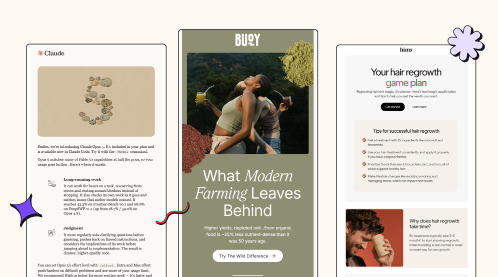
Trend 3: Earth tones, and the principle of softness
If you've gotten an email from Claude in the last two years, you've seen this palette. Hims, Buoy and Duluth Trading all made an appearance, too, with Alexgravitating toward Buoy’s deep, mossy green: "I'm less of a sad beige girl. I will leave the sad beige to Claude. But this deep green, that mossy kind of thing, I'm very drawn to that color."
The design principle here is softness, an approach built around calm, human-centered experiences. It borrows from biophilic design, the practice of replicating natural experiences inside constructed environments, which is why muted colors, curved shapes, and nature-adjacent imagery all read as more soothing than sharp, saturated ones. Softness shows up in tone as much as in color. Alex made the point that it's easy to get caught up in "I need to sell this thing" and forget there's a person on the other end. A little vulnerability goes a long way.
For senders who can't necessarily overhaul their brand palette, one of the simplest ways to soften a message is making the email come from an actual person, complete with a name and a photo, rather than a generic brand voice. Abby's go-to example is already sitting in her own inbox: the small note from Mike that closes out every Really Good Emails newsletter, always with his face and a quick thank-you for being subscribed since a given date. As she put it, it never feels like too much because it reads like a letter from a real person.
This applies just as much to transactional email as it does to newsletters. Abby's experience in fintech showed that bold, clear, even warm transactional emails, guiding someone through an application step by step, tend to perform just as well as anything else in the send calendar. In practice, the color palette is just one entry point into softness. Tone and a real signature at the bottom of the email work just as well.
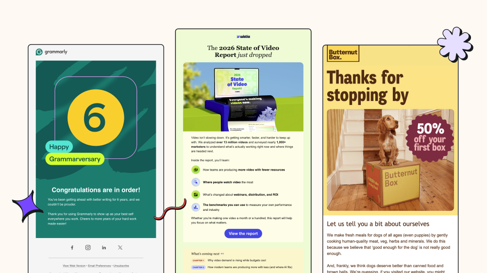
Trend 4: Rounded corners, and the principle of negative space
Grammarly, Wistia, Butternut Box, DocuSign, and Maven all leaned into rounded edges this year. The psychology is straightforward. We associate sharp corners with danger (most of us can recall a specific piece of furniture that's wronged us) and rounded ones with safety, the same instinct behind baby-proofing a house.
Beyond the safety association, rounded corners have a quieter benefit. They force content inward, away from the edges, which naturally creates more negative space, the empty area around and between elements. Logan likened it to the pauses between courses at a proper sit-down meal, echoing the earlier comparison to the Michelin restaurant. You don't need rounded corners specifically to get that breathing room, though. Increasing padding or line height works as well, and Logan showed this too, pulling up that same Glow Up email one more time and taking the line height from a cramped 1.2 up to 1.5. The extra space made the copy noticeably easier to skim, in addition to the font size and padding changes already in place from the earlier pass. What this comes down to is the negative space, whether you get there with rounded corners or just with better spacing.
The Q&A, or answering what was actually on people's plates
A few questions came up during the live session that are worth carrying into any conversation about email design trends.
Does the image-to-text ratio still affect deliverability? Not really, at least not as a direct spam signal. That's roughly a decade out of date, from a period when spammers hid sketchy content inside images to dodge filters. Sender reputation, consistent from name to name, and honoring unsubscribes matter far more now (our deliverability guide for 2026 covers this in full). Abby's addition to that: the ratio still affects engagement, since AI summaries don't read alt text, and providers weigh engagement heavily as a positive signal in the inbox.
How important is dark mode in 2026? Increasingly important, and increasingly hard to control. Alex, who's spent 15 years building emails, was blunt about the limits: Apple Mail in particular gives senders almost no say, and no amount of hand-coding changes that. As Alex put it, borrowing a line from their own therapist, "you can only control what you can control." A few things help anyway.
- Add an outline or glow around logos so they don't disappear against a flipped background
- Avoid pure black or white hex codes (skip #000000 and #FFFFFF)
- Lean toward mid-tone colors, which invert more gracefully than extremes
- Test across clients, since Outlook, Gmail, and Apple all handle dark mode differently
RGE Studio's Dark Mode Preview toggle lets you generally simulate this in the builder before you send.
Are open rates still a reliable metric? Not on their own, though they hold directional value over time. Click-through rate is the metric that matters most, alongside click-to-open rate, unsubscribe rate, and bounce rate.
What about background images that get blocked? Question the intent before troubleshooting the render. What is the image actually adding that a standard hero image couldn't? For alt text, decorative images should get a description of what they show. If there's real information inside the image, like a sale banner, the alt text should reflect that copy directly.
The bigger picture
Trends aren't a shortcut, and following one to the letter without understanding the technique underneath it rarely works out the way you hoped. What this year's session really covered was four principles, each wearing a different outfit: visual hierarchy, scannability, choice reduction, softness, and negative space. Those principles are brand-agnostic because they're rooted in how people actually process information, not in what happens to be popular this year.
For any given trend, you're left with three honest options.
- Adopt it as is, if it genuinely fits your brand
- Adapt just the principle underneath, if the trend itself doesn't
- Leave it on the shelf if neither one earns its place in your inbox
If you want to apply any of this while you build, RGE Studio can help with the mechanics, things like semantic structure, alt text, dark mode preview, and Outlook-friendly rounded corners. And if you'd rather watch the next course get made live, stay tuned for our next webinar, an Email Support Group session focused on navigating AI in email, including how to actually prompt for it.
Articles to whet your whistle
Subscribe to our newsletter.
Dive into the world of unmatched copywriting mastery, handpicked articles, and insider tips & tricks that elevate your writing game. Subscribe now for your weekly dose of inspiration and expertise.